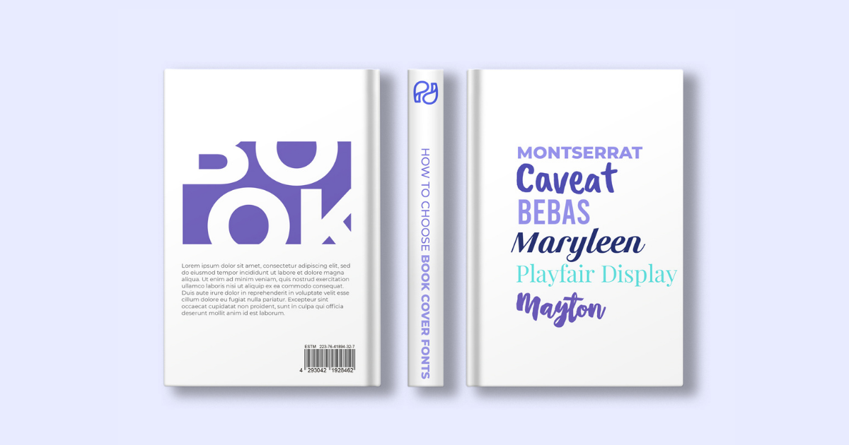
How to Choose Book Cover Fonts for Aesthetic Results [21 Book Cover Font Examples Included]
As an author, your immediate concern is to finish your manuscript. You work tirelessly to reach that milestone, and once you accomplish it, your next stageis to contact several publishing houses or to self-publish.
If you go with traditional publishing, your publisher will handle editing and publication, and you will likely have little influence over how the end product (book) will look.
However, if you self-publish, your still have a lot of work to do.
You will have to design your book and create a marketing plan to reach its intended readers. You will have to edit it and then commission an illustrator to do the cover design or use Canva to do it yourself. You will have to ensure that the cover stands out from thousands of others and impresses your readers. Cover illustration or image is only part of the hook. The typeface is the other part, so let's speak fonts (best title fonts included).
Why Good Fonts Matter (and not just for book covers)
If you, too, have pondered over the best fonts for books and have been investigating how other authors aced this by browsing famous book covers or searching the internet for clues over cool book covers or best book covers, this is definitely for you.
1. Book fonts increase the content's charm
Good fonts enhance the readers' experience of the book's content. Serif fonts, for instance, are used in more informal books, such as those for children and young adults. On the other hand, Sans-serif fonts are used for more formal writing, as it has fewer embellishments, and the simpler the fond, the more focus on the content. The larger the font family, the better, as it allows for more varieties. Chapters and headings are usually a weight combination of writing (light to bold) within the font family.
2. Book fonts boost readability
Have you ever wondered how some books you just can't stop from reading? Yes, it is the plot, that one character, and those immersive set-ups, but have you ever wondered if writers don't also have another trick up their sleeve? Not all professional fonts are suitable for books, but those that work well impact and boost readability.
You do not need to become a typography specialist, but you should pick up some tricks to achieve a great product when publishing. When reviewing your manuscript, consider not just fonts but also line spacing, font weight, margins, and space between paragraphs.
In some book categories, readability is crucial to keep the reader manageable with details that are difficult to follow. Take fantasy, for instance; you should be able to read but also feel free to imagine what you are reading without being too text conscious.
3. Book fonts strengthen reading comprehension
Once you understand the link between the font and the reader's ability to take in the message you are trying to convey, finding that perfect font should be your next aim. Think of it like a passage; the easier the route, the happier the travel.
Browse books you like, and try to look at them from a professional's perspective. Your font should not detract attention from your book and should definitely not be overwhelming.
If you find a font you like in a printed book, the colophon will give you information regarding the font's name. If, on the contrary, you are using an e-reader, several software programs can help you discover the book font. What the font gives you the answer based on drag & dropped image. Font Finder will also suggest 60+ other look-alike fonts.
How to Treat Your Fonts
Before treating your editor and readers nicely, make sure you learn how to treat fonts; the former will also be happy with a good decision. Quirky title fonts are essential, but good fonts and a great match with the cover design should be those you aim for. Read a few considerations below.
1. Pay attention to legal bits
Make sure your font is free to use, or pay for the one you want to use. You definitely wouldn't want somebody to use your book however they like. Neither do typographers. Make sure you check if the font is free to use for commercial purposes.
Most typefaces come with a built-in theft check feature: you can use them on your computer but cannot embed them into a PDF (which is needed for your cover to look the same on every computer and even in print).
If you are unsure, find out who owns the font (it can be the graphic designer or a company) and ask them to clarify. There are a variety of commercial fonts, and you may have to purchase one, but free ones are out there too.
2. Know their font family
There are five different classifications of typefaces: serif, sans-serif, monospaced, script, and display.
Each of them with its own purpose:
- Sans-serifs are better for body texts because they are much more readable than serifs.
- Monospaced fonts are fixed-width and work best for shorter texts.
- Script fonts have a repertoire based on handwriting. They're elegant and work for shorter texts or titles.
- Display fonts are very eye-catching, meant for large sizes, and perfect for titles and handlines.
Regarding titles, size matters; you want your short or long title to be legible, even in a thumbnail. Once you are confident that it looks good, be sure to view it in thumbnail size: around 100px.
3. What's in a name?
Never hurry to judge a font by its name, though some are pretty delightful. Instead, look a bit to assess its usability. Good fonts are versatile and combine readability with excellent aesthetics.
When buying or choosing a font, make sure it has a complete set of letters and characters (especially if it’s a gimmicky typeface). Also, consider kerning (letter spacing) for title fonts and make sure that what you have written and what it reads are the same.
4. Treat your typeface with care
Do not stretch the fonts or try to change them in any other way. These fonts are carefully designed to look perfect. Most fonts come with different weights and styles. If your font can't do what you want from it, use a different one.
Popular 2024 Fonts & How to Choose Title Fonts
There are numerous covers with cool writing fonts that I have browsed in the past years and as the publishing industry developed, so have the ways to capture the readers' attention.
What truly made a cover stand out was not the font itself but that perfect match between design, illustration, and font. Or a combination of two fonts: I have seen classical-looking fonts combined with edgy and minimalistic ones and some daring cover fonts with very plain-looking ones. Or the go-to mix of serif with sans serif.
But you must be very careful when choosing more than one font for your book cover. A font combo can make or break a book cover design.
Though all fonts have the potential to be good title fonts, regardless of whether you are looking for an aesthetic book cover or a minimalist book cover, here are some ideas to keep in mind:
- Great title fonts are eye-catching;
- Title fonts should be highly readable (think marathoners doing window shopping);
- The overall feeling of the cover should be indicative of what the book is about;
- A font attracts more attention when placed on a book cover with professionally designed imagery.
Search for a typeface by genre
The easiest way to nail all the above is to browse your genre and get into the overall mood. Yes, your book is to stand out, but not to stand alone, and you will have to weigh in on your expectations and the genre of your work.
Let's do a quick tour.
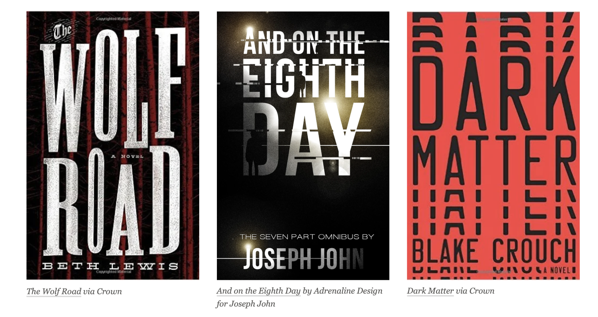
- Mystery and Thriller
Layouts are simple yet eye-pleasing. Think dark color covers with bright-colored fonts. The back images are crisp. Drama is suggested in the background; it might be abandoned houses, broken plates, or a bloody knife—nothing too disruptive, just a vague suggestion that something is about to happen.
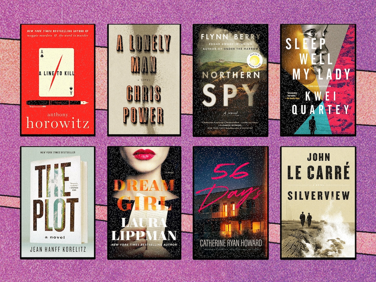
As for the book fonts, you can’t go wrong with one of these:
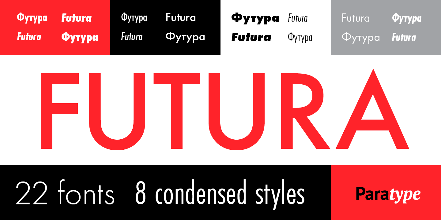
1. Futura
A font designed in 1927, was inspired by the geometric shapes of the Bauhaus. It balances avant-garde and traditional qualities, has cutting-edge and forward-looking forms, and is accessible. It once dominated mid-century design.
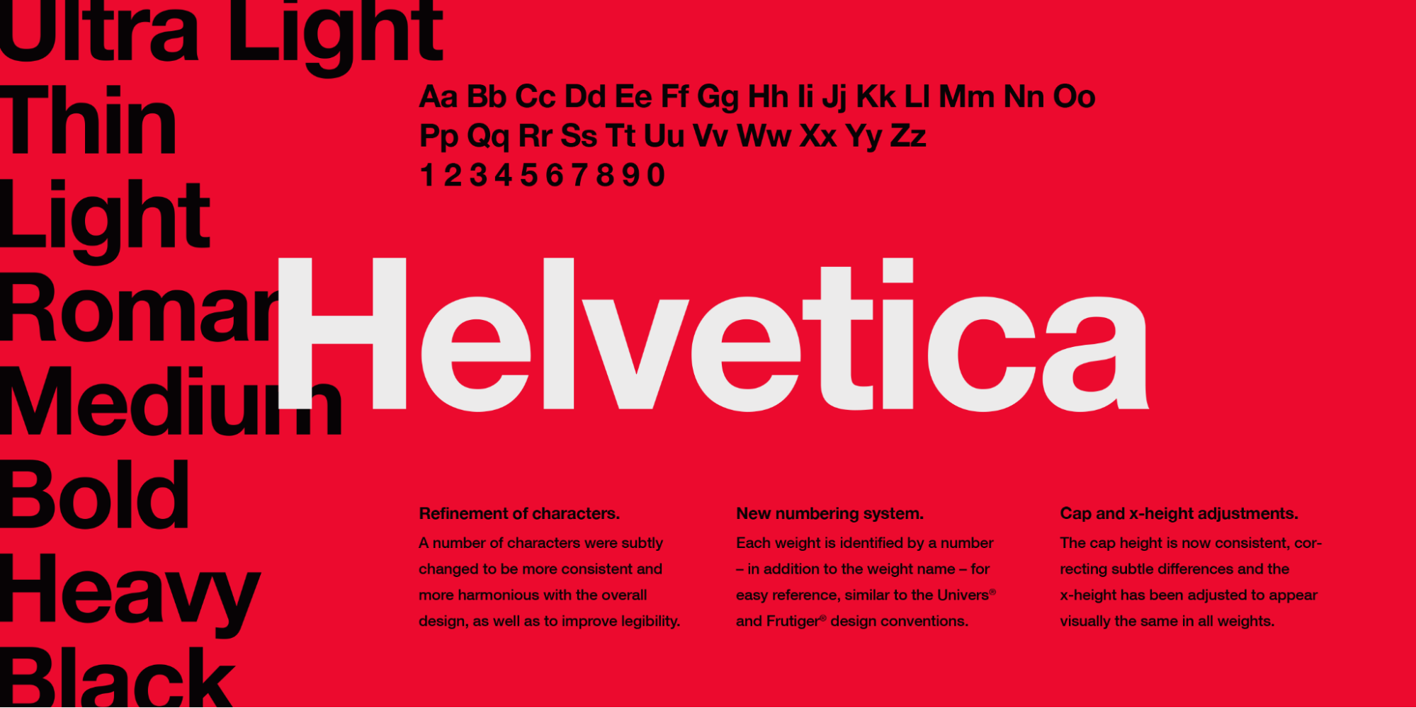
2. Helvetica
A font designed in 1957 by Swiss typeface designers Max Miedinger and Eduard Hoffmann, was built to convey a message and look simple yet stylish while doing it. The font is so popular it has a documentary tracing its story.
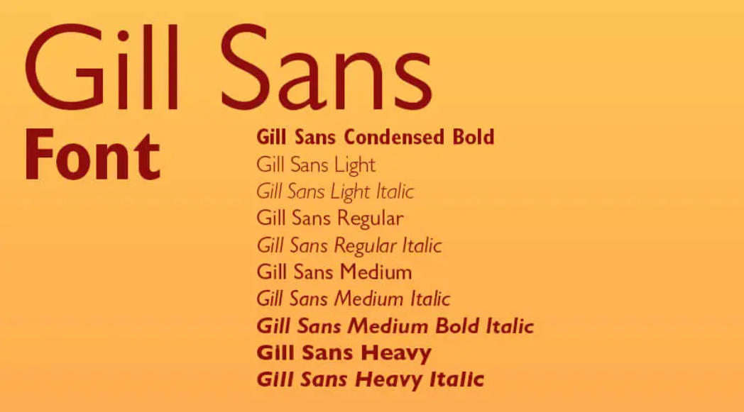
3. Gill Sans
This popular font comes in different styles (the Gill Sans Font family includes 15 Typefaces). Because of its versatility and availability in Google Fonts, you should consider giving it a go. It looks great on the web and in printed format and is free for personal use. The license to use the font family at its fullest comes at a small price. Then it’s up to you to make the best of it.
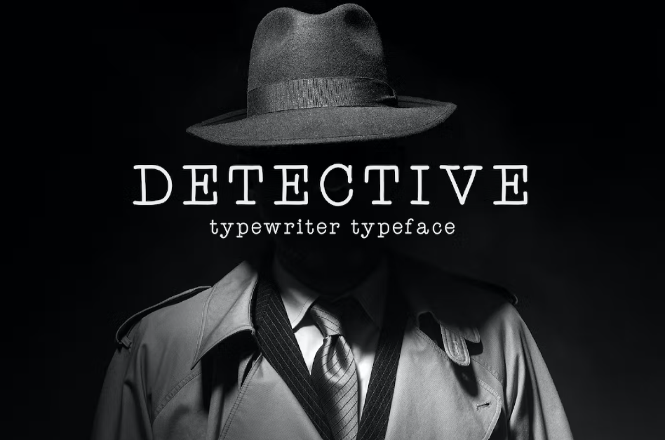
4. Detective
The Detective font should be your go-to if you love that retro typewriter feel. Should your text look like punched into paper from an old mechanical device? Are you writing a spy story trying to seduce readers with a charmingly old-fashioned feel? If so, this book font is for you.
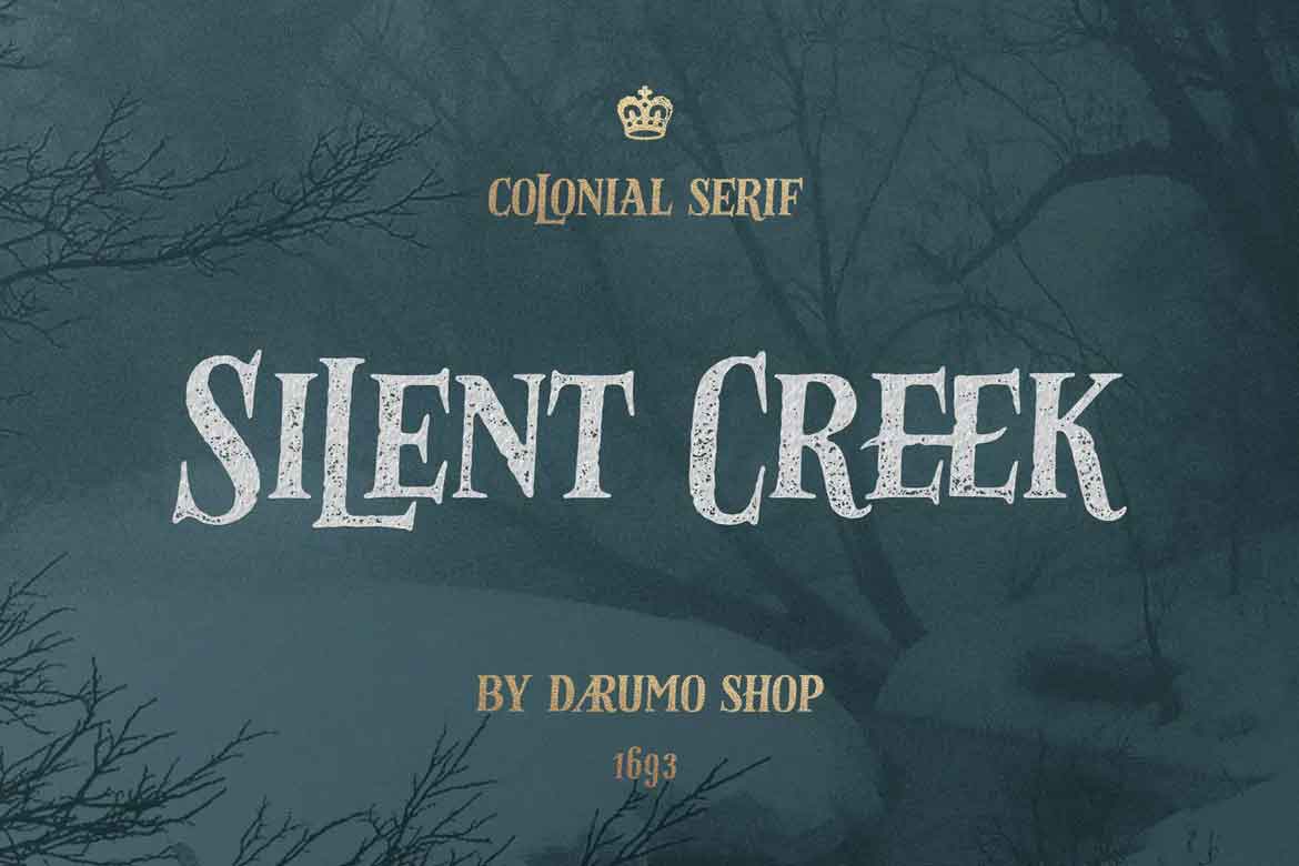
5. Silent Creek
Silent Creek is a perfect fit for thriller covers with a vintage design. The letters have an eerie and somewhat mysterious edge, making one think of calm water running deep. The kind of look that makes thrillers so thrilling, so to speak. The font comes in two styles, regular and distressed, and has an abundance of decorative symbols, including some very fine crossed keys, skulls, and crossbones. Nice touch, right?
- Romance
Are you looking for romance fonts? Contrasting colors are frequent, and pink, well, pink, is a go! Think cursive and seductive—the cover, lush and eye-catching, highly instagrammable, steamy if featuring couples.
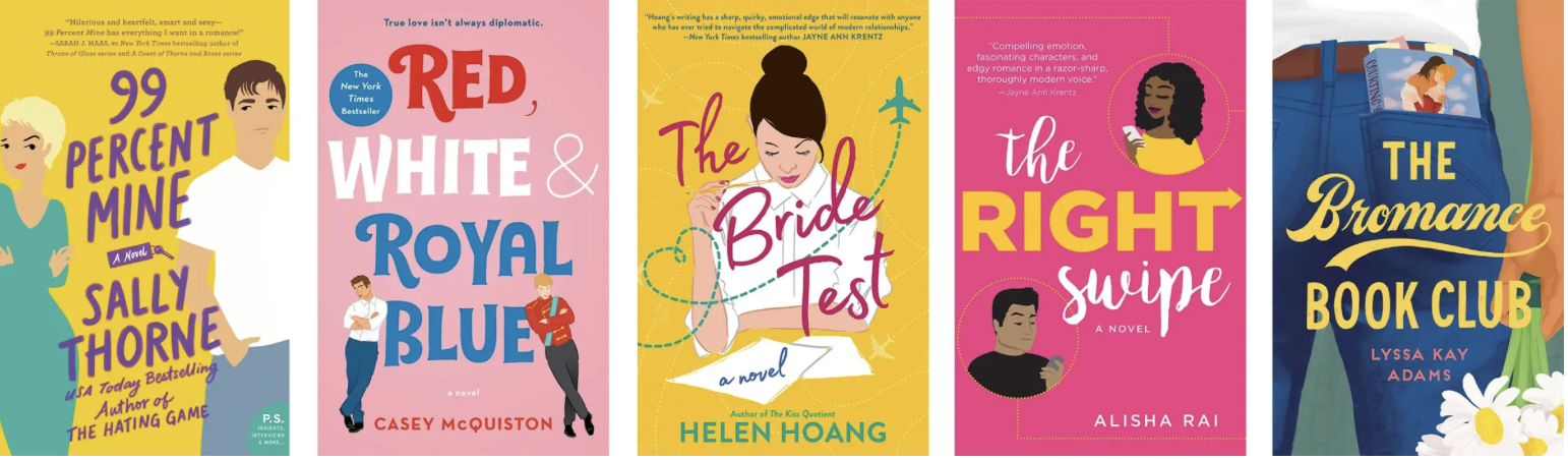
If love is on your mind and especially in your plot, here are some good book fonts to consider.
This is an elegant handwritten sleek font with delicate letter fonts. It can easily go among your favorites for your romance novel, as the font comes with stylistic alternates to experiment with.
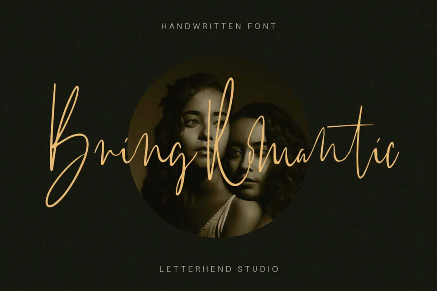
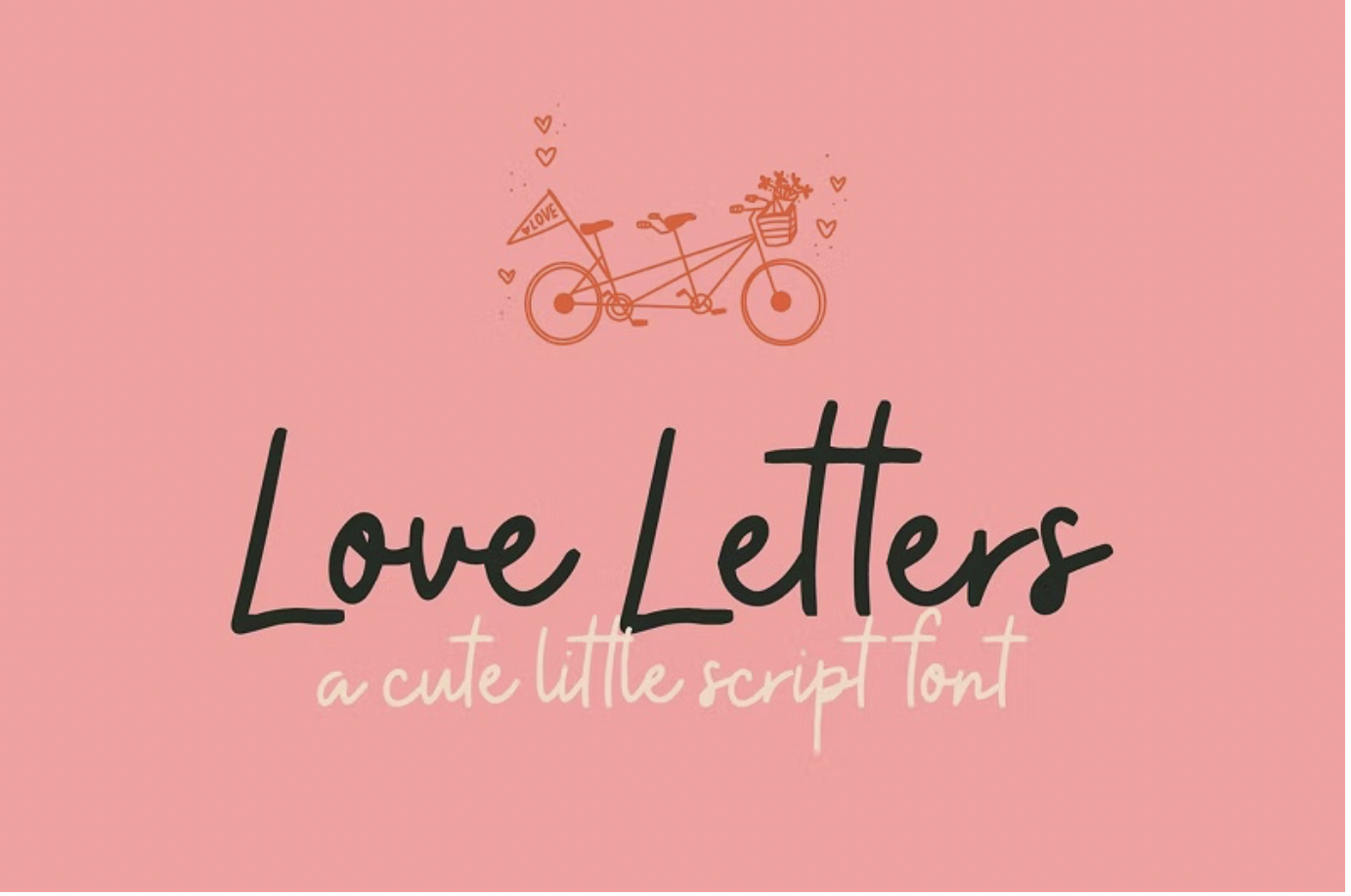
7. Love Letters
This book font is edgy but sweet, just like your lighthearted rom-com. It’s also free to use.
- Fantasy and Sci-fi
Lots to mention here, but to sum up: bold colors, some post-apocalyptic, eye-grabbing imagery suggestive of the world or universe described in the book, and a large typeface. These types of covers are (& should be) instantly recognizable. Cover colors are mood markers for this bunch, and the layout is usually generic by desire; you want your audience to know your book falls under this category. Your cover should set the tone for the plot.
Dreamers shall be dreamers, from book cover to toe, so here are some title fonts you could use.
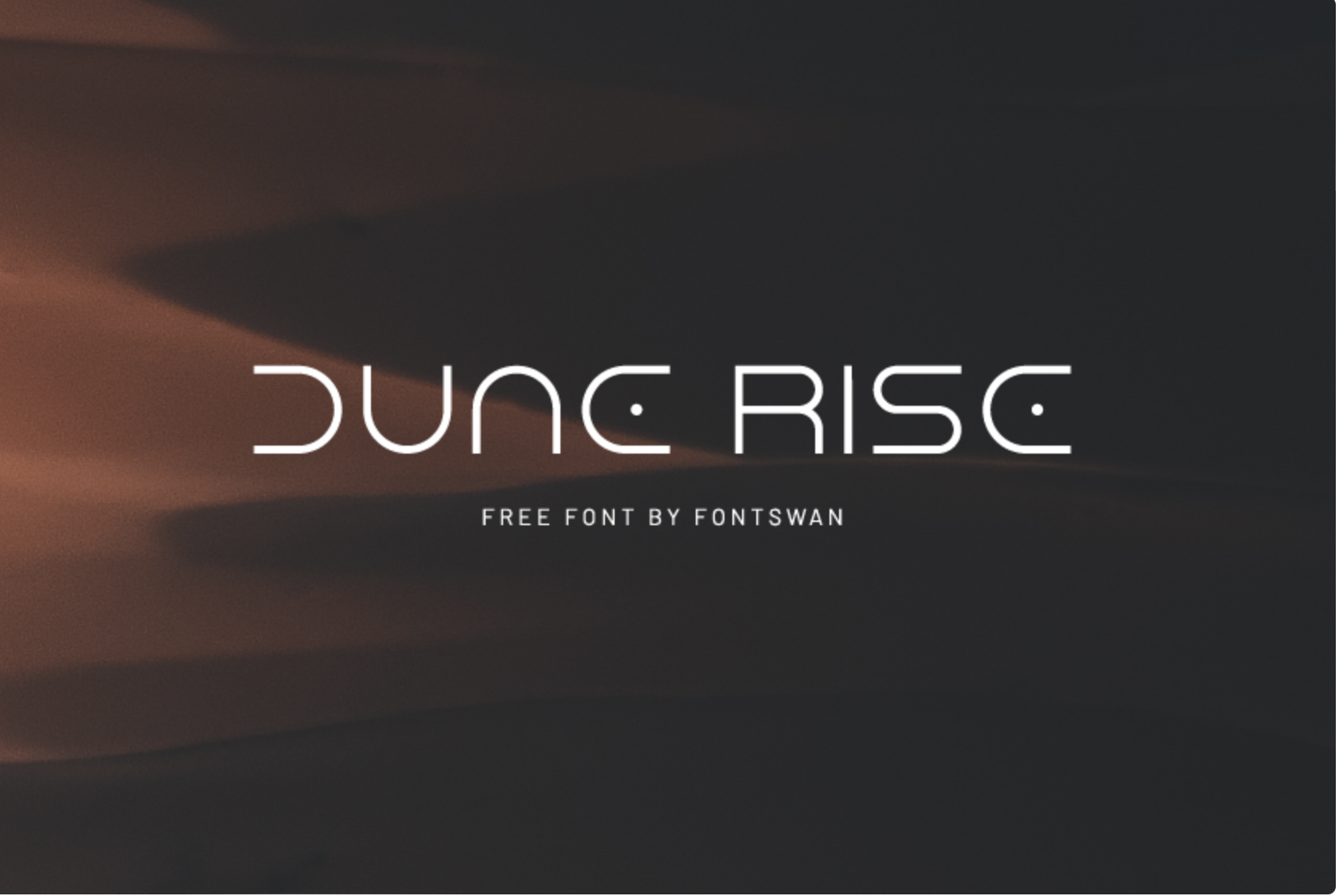
8. Dune Rise
This Is a free book font inspired by the title text on the blockbuster’s poster. It suggests a futuristic theme, perfect for a sci-fi book title.
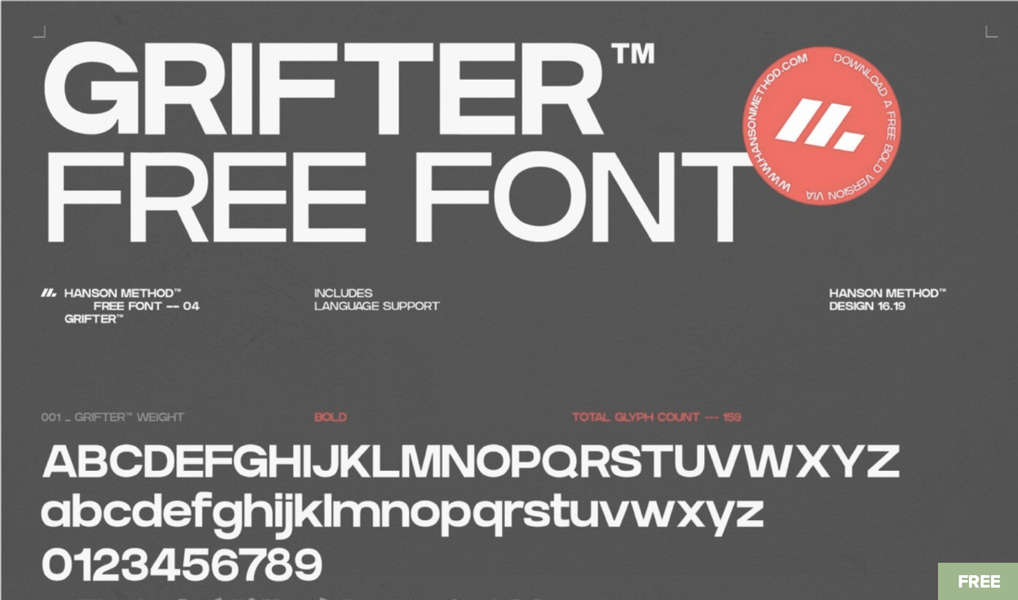
9. Grifter Bold
A thick, bold font that is attention-grabbing. It includes both upper and lower case letters and is free to use.
10. Stunegart
This is a blackletter font inspired by Medieval calligraphy, perfect for medieval fantasy and goth writers.

11. Helios
Futuristic, all caps font that includes many alternatives.

- History and non-fiction
Are you looking for the best fonts for your history book? Look no further. There are no bests, but there are some preferred typefaces. As the saying goes, if it ain't broken, don't fix it.
You can go for:
12. Addington CF
A sans-serif font with an elegant feel that comes in 7 different weights, including italic sets. It’s ideal for non-fiction, but its versatility makes it perfect for other genres too.
13. Thinkerbery
This book cover is a non-fiction go-to: modern, clean, and professional.

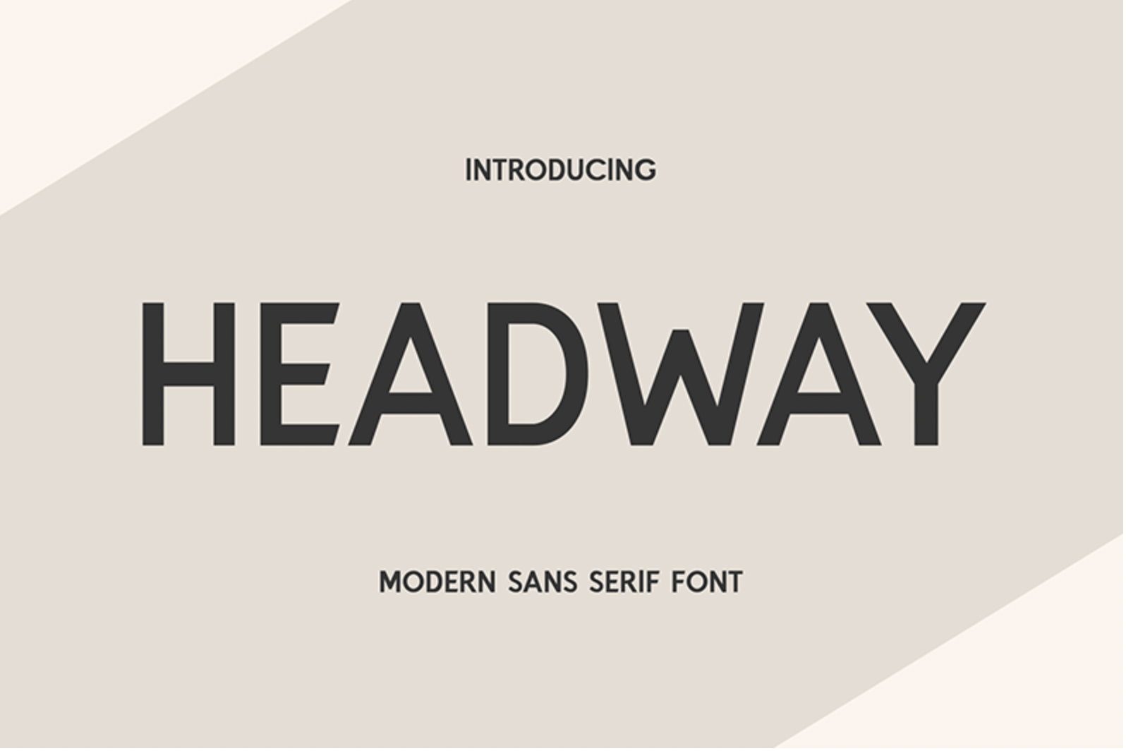
14. Headway
This is a simple sans-serif font with a clean, hip, and contemporary design. Perfectly suited for non-fiction.
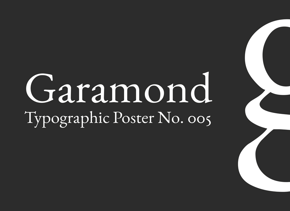
15. Garamond
This font is the crowning of what aging with style means. The font has an elegant and royal demeanor without being too extravagant. At nearly 500 years old, Claude Garamond started this extended family of fonts in 16th-century Paris.
- Young Adult
You can always judge a young adult book by its cover. That translates to an easily readable author's name and handwriting-looking title. Fonts are considerably sized, the color palette is straightforward to discern, and the cover design usually screams excitement and an adventure-packed plot. What not to like?
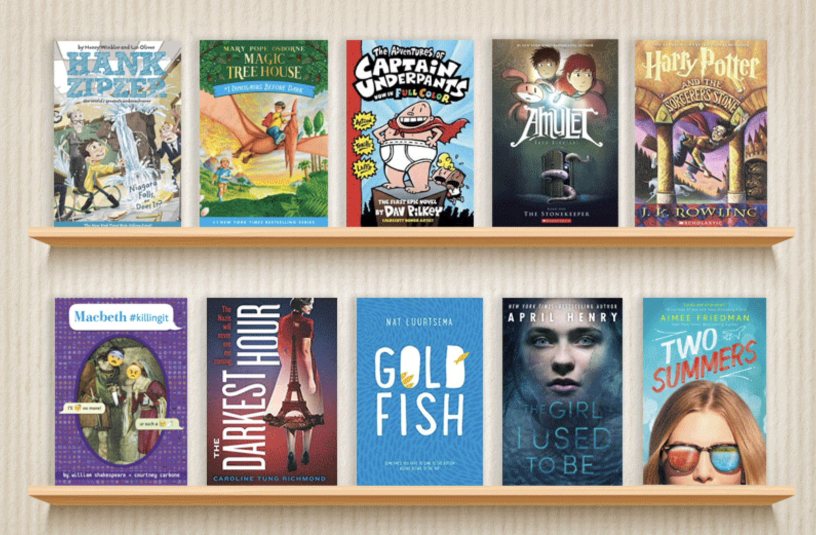
Here are some cool and cheerful book fonts for the youngest and most playful.
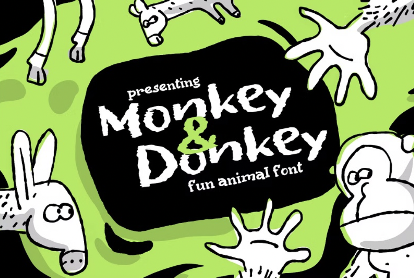
16. Monkey & Donkey
With its unique letter forms and casual design, this book font is the perfect fit for our most demanding readers.
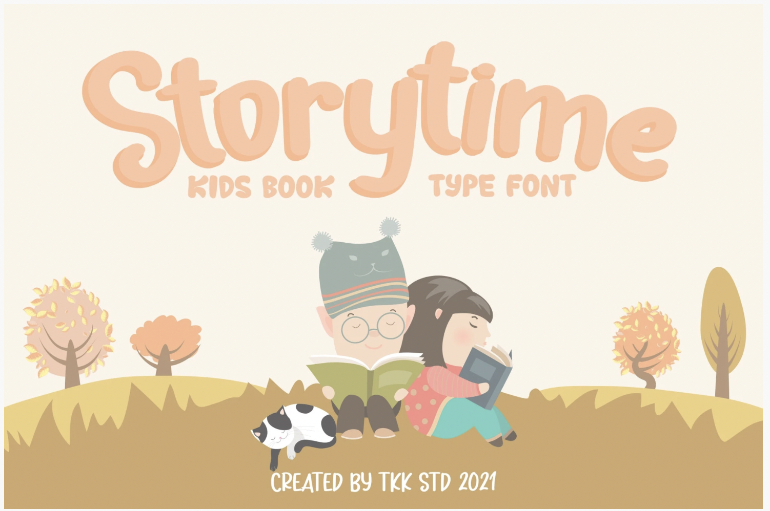
17. Storytime
A clean, modern book font that feels very at home for the youngest audiences. Comfy and nice, perfect to get them into the right atmosphere.
Go for a timeless feel
If you don’t want to browse them by genres, you can go for a book font with a timeless and classic feel.
So, when in doubt, go for a versatile font. I have a few suggestions.
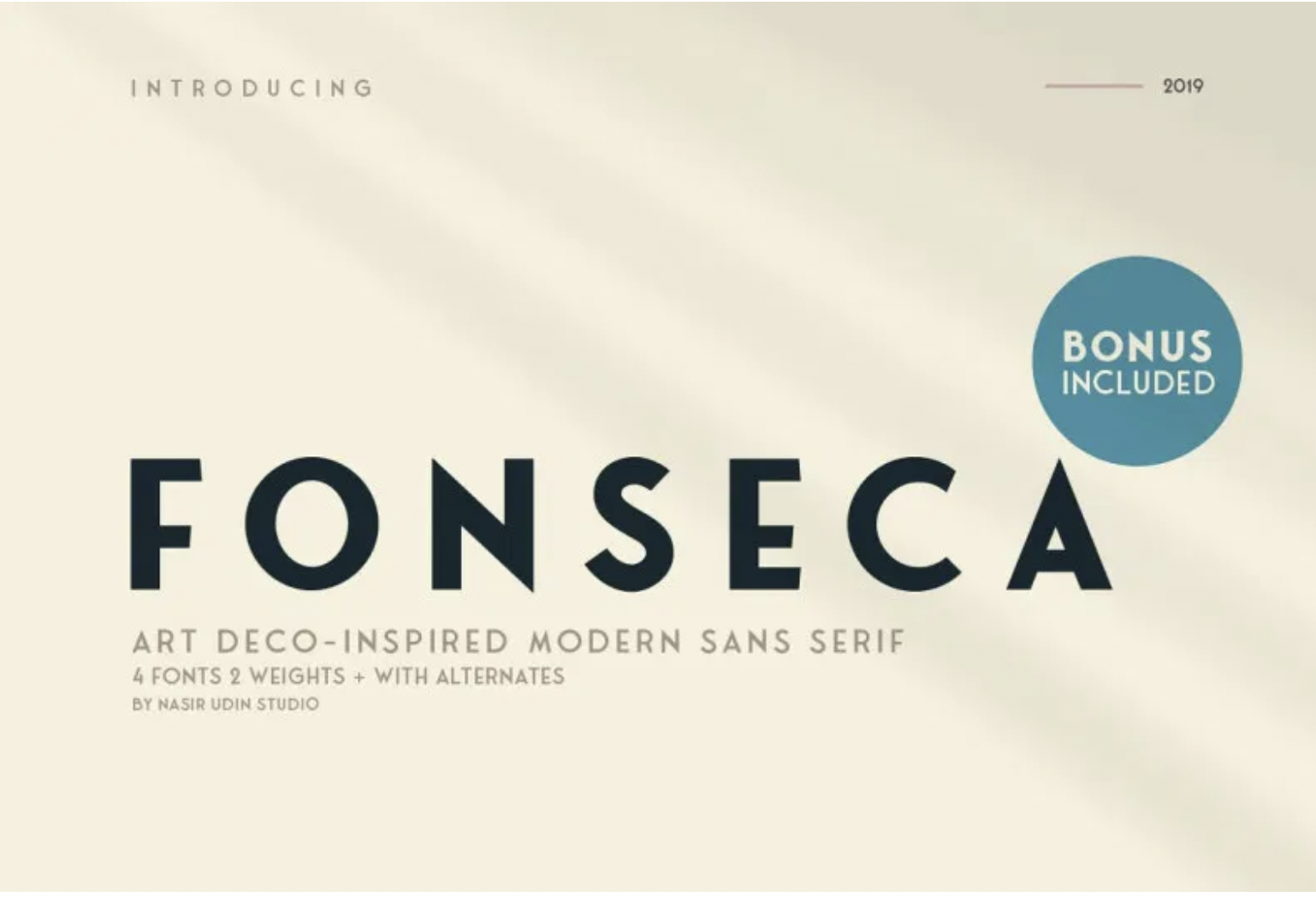
18. Fonseca
This book font is art-deco inspired and a sans-serif in all caps. Geometric, versatile, and modern, looks amazing on book covers, regardless of the genre. Fonseca is impactful and easily readable. It comes in 8 weights with 345 glyphs and stylistic alternates.
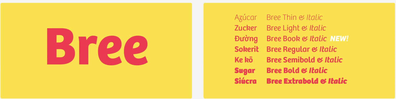
19. Bree
A versatile, friendly, and easy-going font for your book that is free to use. If your approach is less is more, this book cover font is for you.
20. Aoki
This one’s a sans-serif font with a soft feel and rounded cornered letters available in three styles: regular, light, and inline.

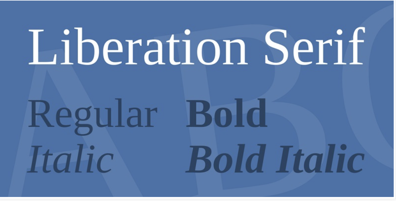
21. Liberation
If you are fond of Times New Roman font, this is a small variation of it. This book font is simple and readable, and it comes in four versions: regular, italic, bold, and bold italic.
How to Nail Your Book Cover Design
There is no recipe for the perfect book or book cover. But essentially, I would sum it up to the following:
- Be bold in choosing your font and design;
- Be thorough in researching your genre;
- Be brave in facing your reader;
- Be mindful of the most important design principle—white space—to avoid clutter.
It may not seem much, but the best is yet to come once your book is available for your reader.